 Ontario
2000 Ozone Animations &
Maps
Ontario
2000 Ozone Animations &
Maps
Ontario
2000 Ozone Animations &
Maps
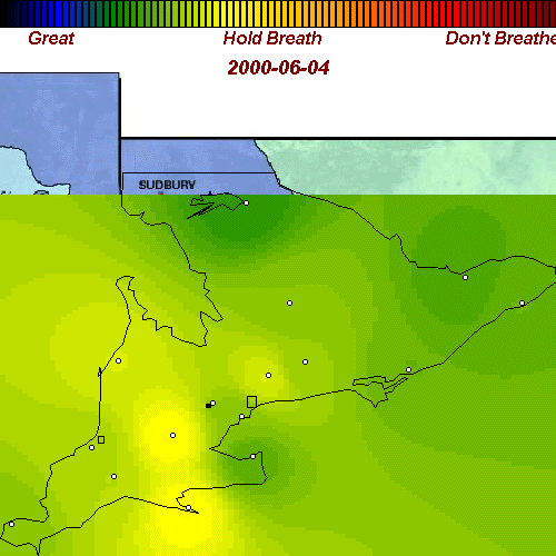
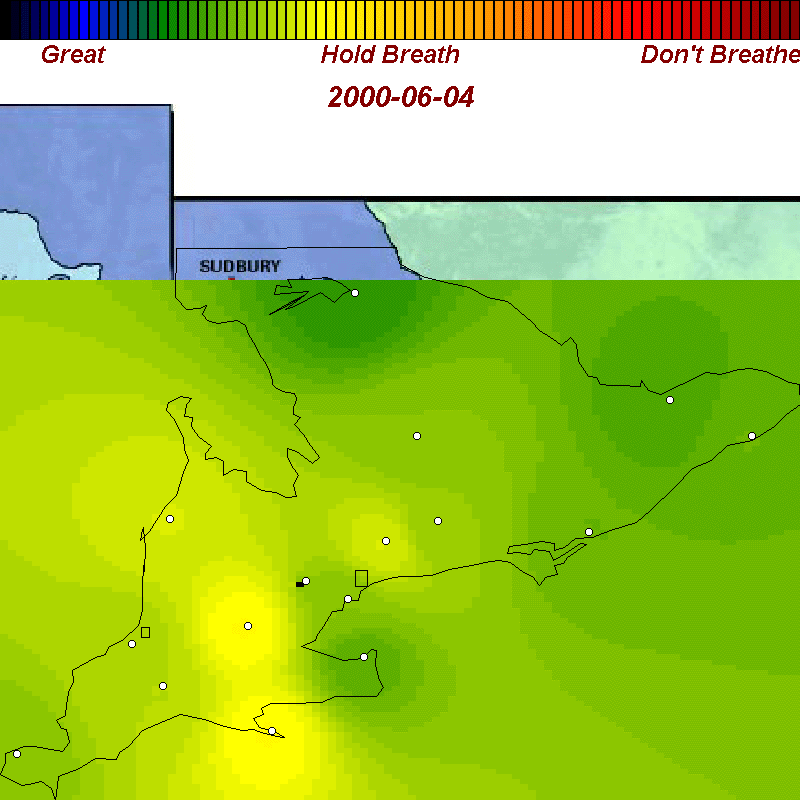
These animations and maps were produced from Ontario government ground-level ozone measurements (daily peak readings) on the Web (http://www.airqualityontario.com/) using a weighted average interpolation technique to estimate values between the 16 measurement sites. Here's an example of one of the data sets from which we constructed our maps.
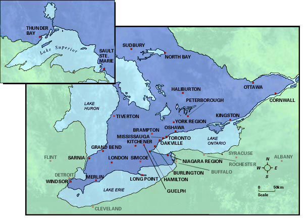
We used the same raster bitmap of Ontario as the Ont. Govt. does for direct comparability.
Our map is overlain atop this bitmap.
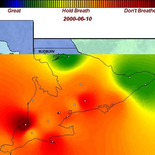
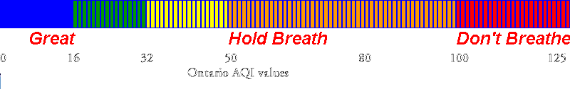
The interpolated data was then rendered using a color scheme in which a continuous gradation of colors was assigned, with deep blues for very low readings, to deep reds for readings near or exceeding the provincial standard. Our color scheme:
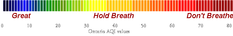
Note: this is a different range of color values from those used by the Ontario government or the EPA. Our range is similar to the government scheme at low pollution levels, but shows more details during high pollution episodes. We based our scale on abundant medical and epidemiological data showing that health is effected for many people at levels below the provincial standard. The Ontario government's scheme is shown below:
Their scale is chosen to present a very simple picture - but most of the information about what's happening when air is in the poor quality zone - readings from 32 to 80 - can't be seen because they use only yellow and orange for this range.
To better show this area of greatest concern we used a spectrum of colors, so more of the variation can be seen. Our coloring becomes reddish on the worst air quality days we experience, days when significant numbers of people with sensitivities will experience some problems. To see the difference, click on the two thumbnails below to see their view (left) and our view (right) of one day with bad air.
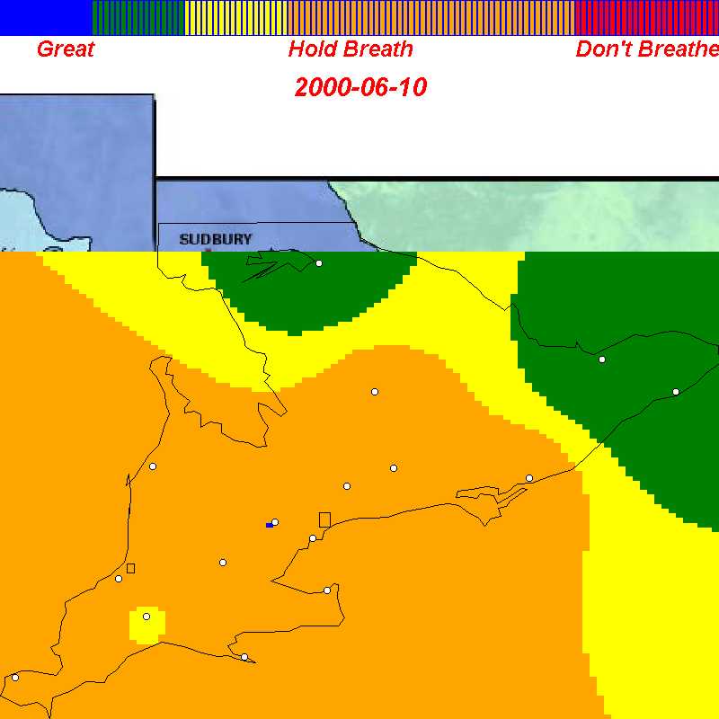 <-- Ont. Gov't.
Ours -->
<-- Ont. Gov't.
Ours --> 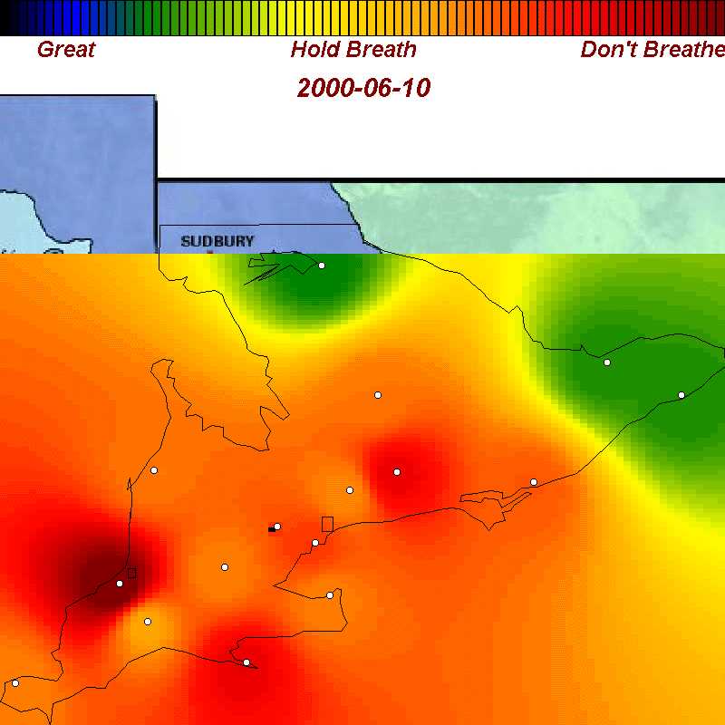
One final note: although the EPA maps use the same color scheme as the Ontario government, they are based on different standards and so are not directly comparable.
For more details on how our maps were constructed, click here.
The animations show daily peak readings for a 11 day period in June during which a mass of low-quality air spread from the mid-western United States into Ontario (for comparison, see the EPA maps for the same period)
| animation: smaller images - 540KB |
|
| June 4-14,2000 | animation: bigger images - 1.2MB |
We've recorded example of good, poor, and bad air days throughout spring, summer, and fall of 2000 in Ontario. Each map is about 42 KB. We've purposely omitted many days with good air quality so the sample you see below is oriented towards showing you the worst.
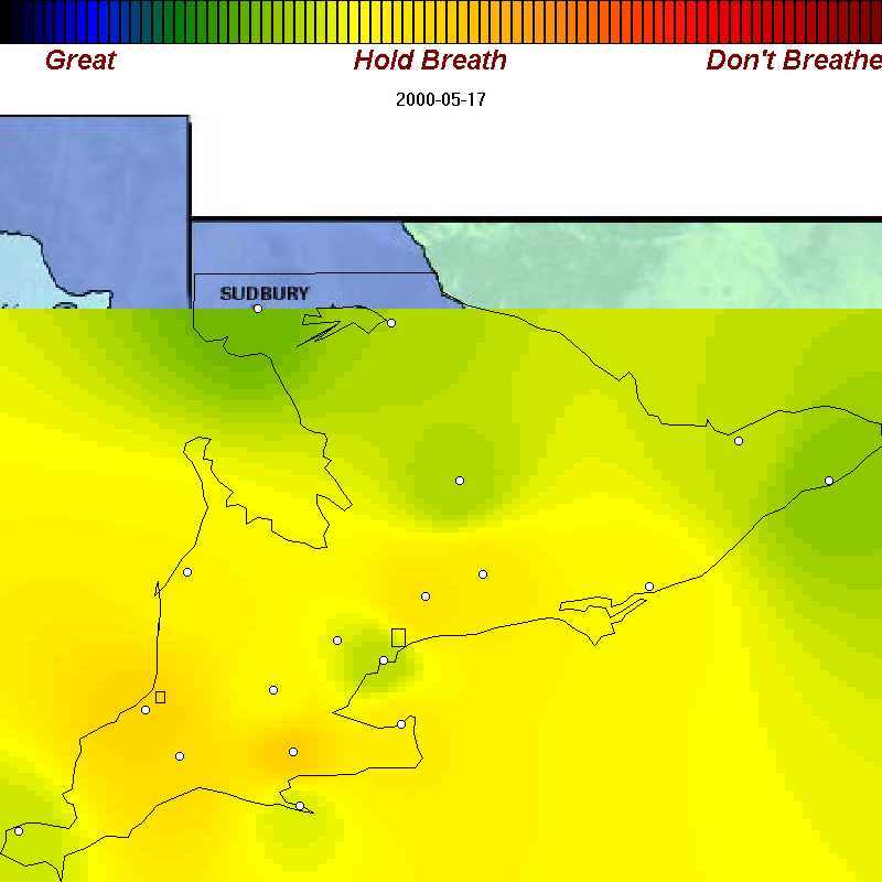
| May 17, 2000 | a poor air day in spring |
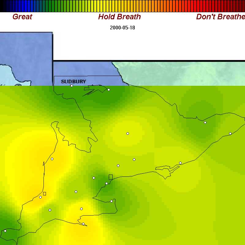
| May 18, 2000 | poor air near Erie and Huron shores |
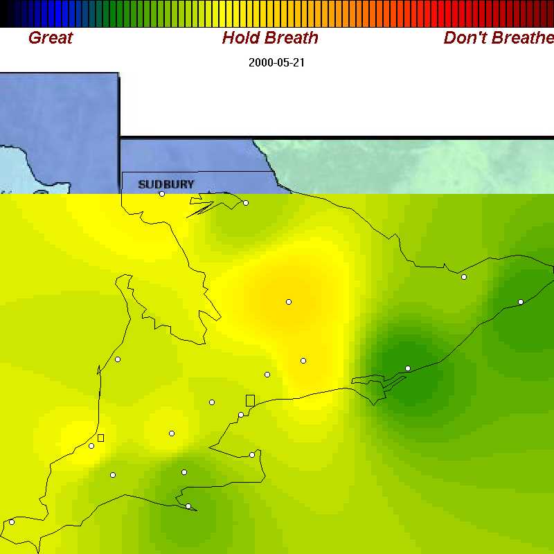
| May 21, 2000 | poor air in Muskoka in spring |
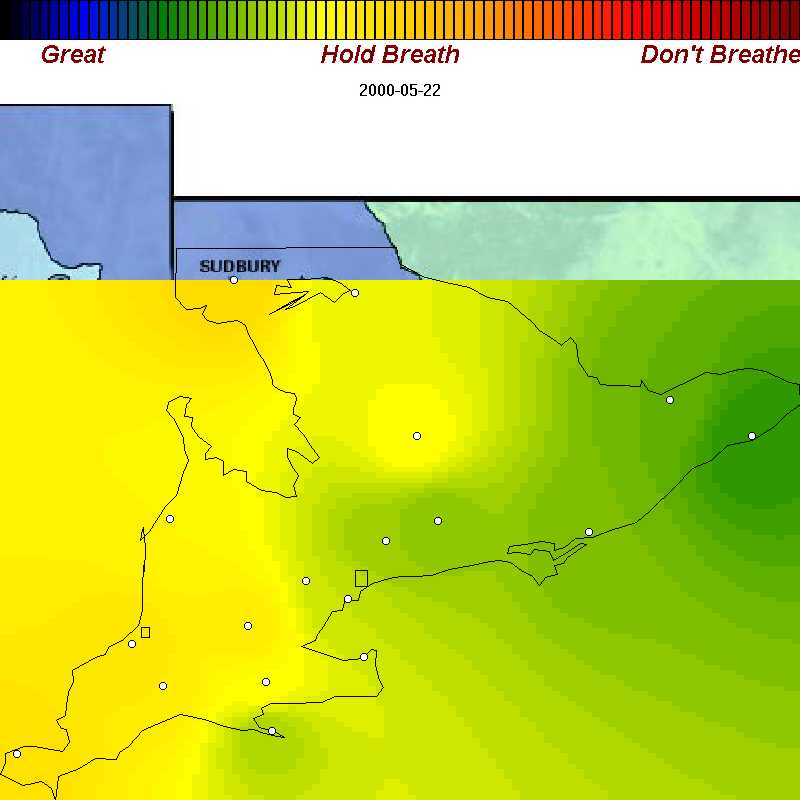
| May 22, 2000 | poor air moves in from SW for Victoria Day |
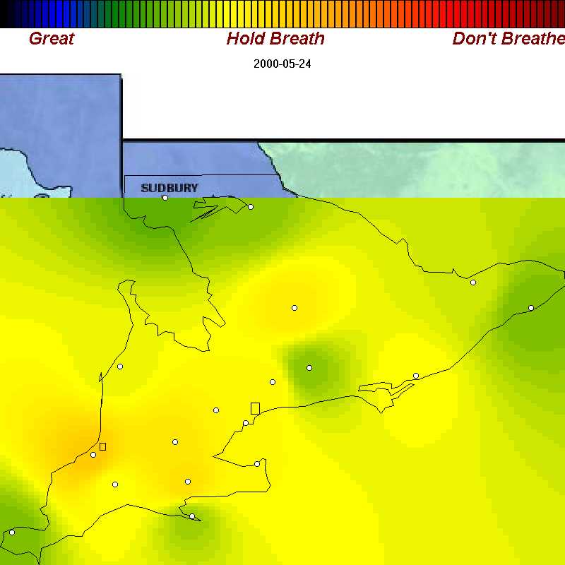
| May 24, 2000 | poor air everywhere for Queen Victoria's Birthday |
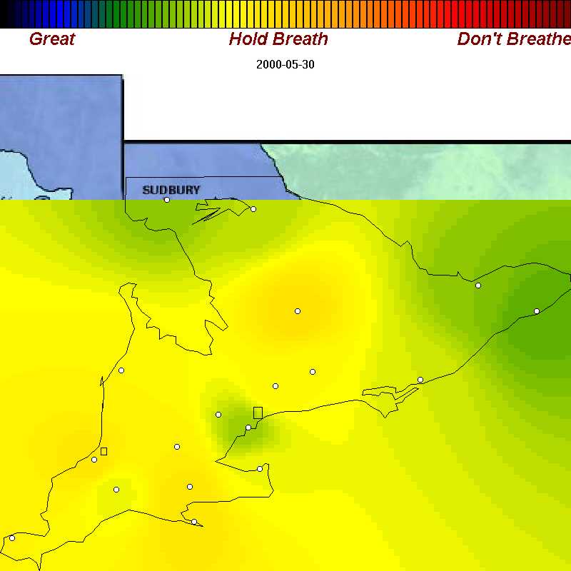
| May 30, 2000 | poor air everywhere again |
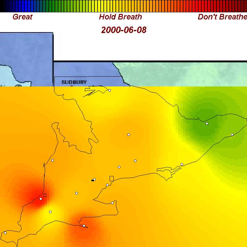
| June 8, 2000 | One of the worst air masses of the summer arrives from US |
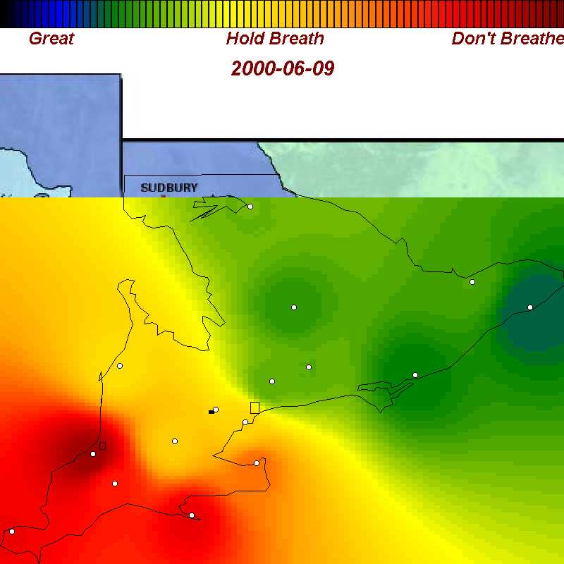
| June 9, 2000 | Bad air intensifies in SW Ontario but cottage country gets some relief |
| June 10, 2000 | Bad air covers all of southern Ontario except for the eastern counties |
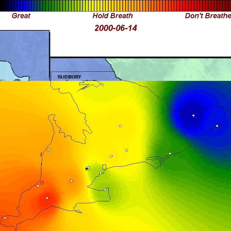
| June 14, 2000 | After a short break, bad air returns to SW Ontario |
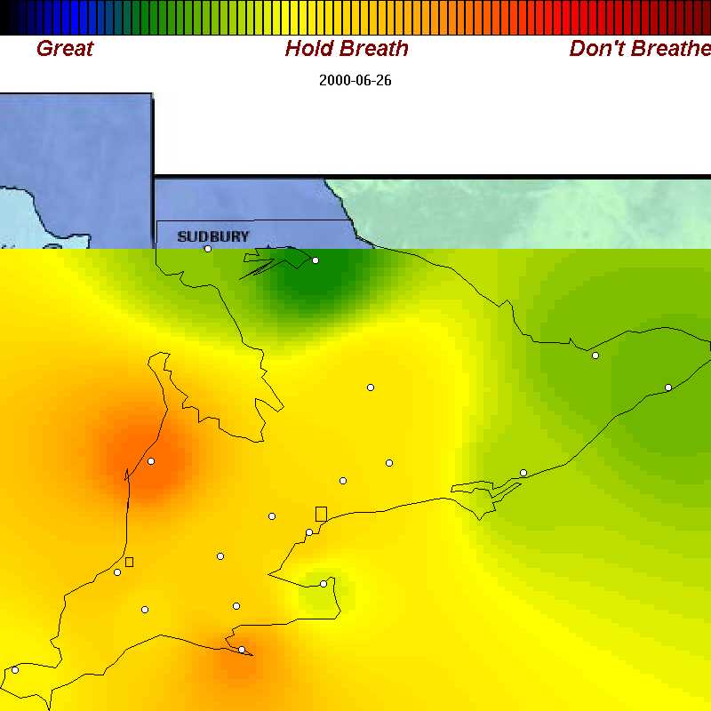
| June 26, 2000 | Poor air in Kincardine, Tiverton,Long Point, and Muskoka |
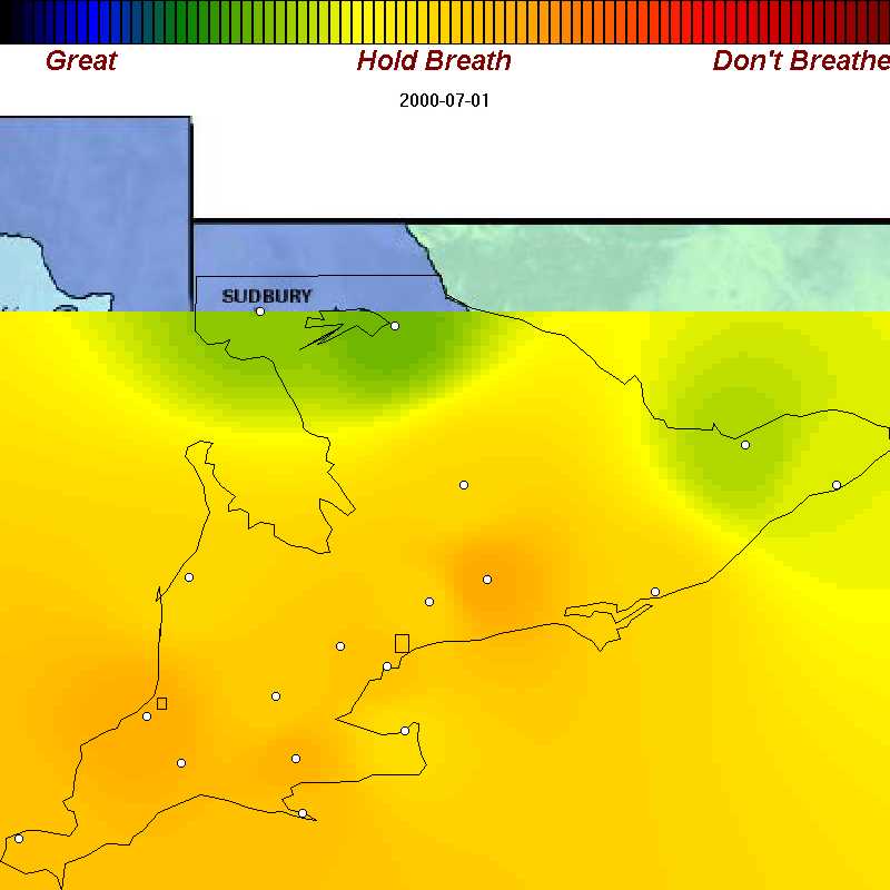
| July 1, 2000 | Poor air for us all for Canada Day! |
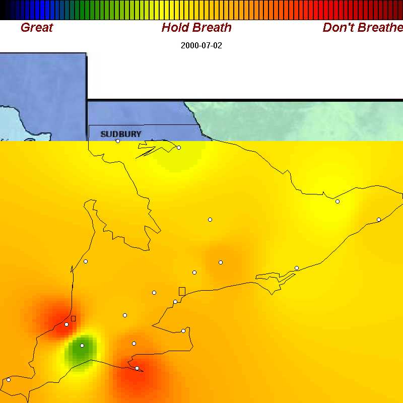
| July 2, 2000 | Poor air worsens to bad in Grand Bend and Long Point |
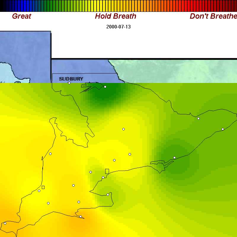
| July 13, 2000 | Poor air again |
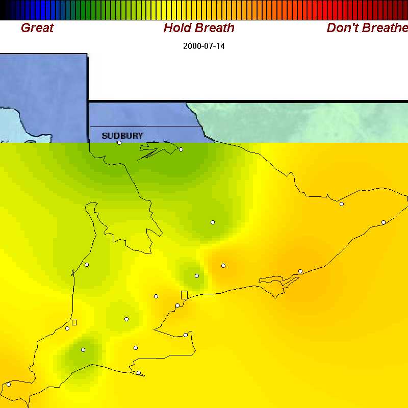
| July 14, 2000 | Ontario celebrates Bastille day by sending poor air to easter townships and Quebec |
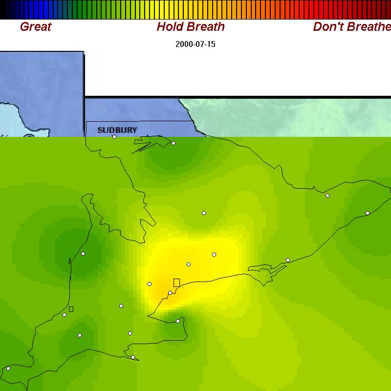
| July 15, 2000 | The way people expect it to be: poor air only in Greater Toronto area. This is the exception, not the rule |
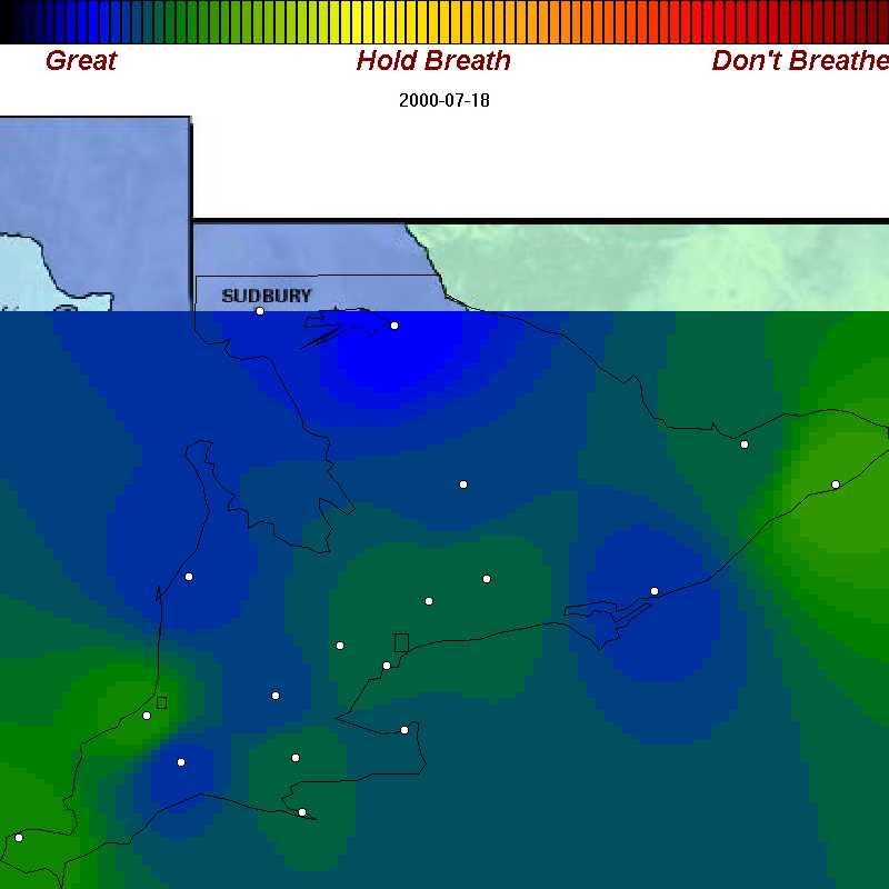
| July 18, 2000 | The way we'd like it to be: good air in all of Ontario |
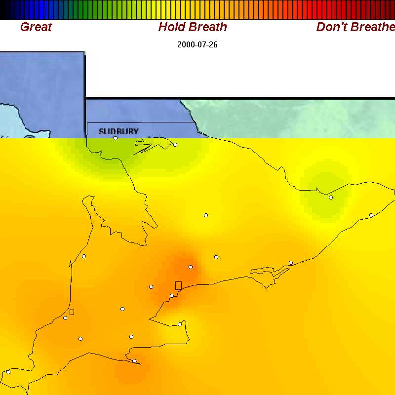
| July 26, 2000 | Poor air everywhere south of North Bay. |
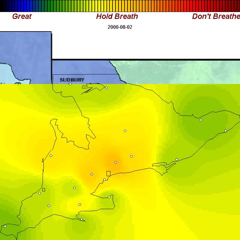
| August 2, 2000 | Yawn - more poor air everywhere for starting August |
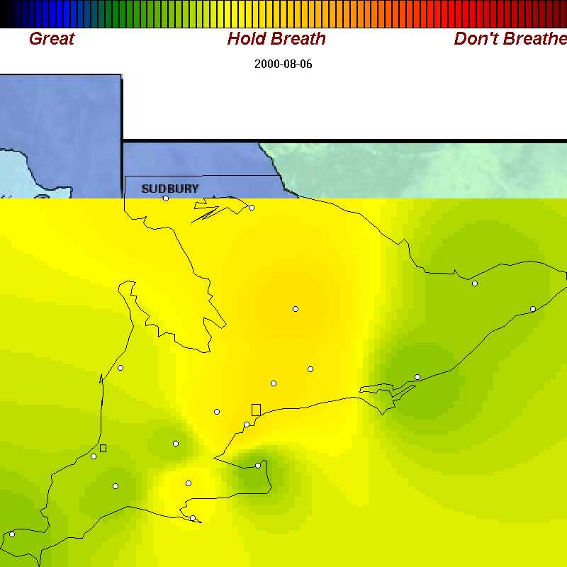
| August 6, 2000 | Poor air from the GTA to North Bay, just in time for the holiday weekend |
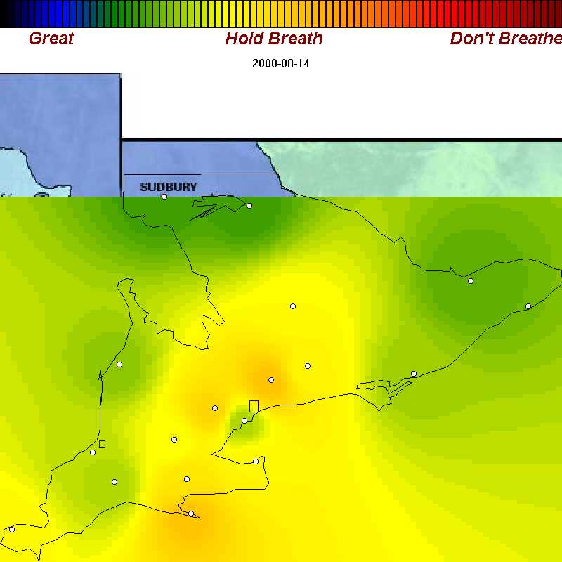
| August 14, 2000 | Poor air everywhere except Toronto - see below for reason why |
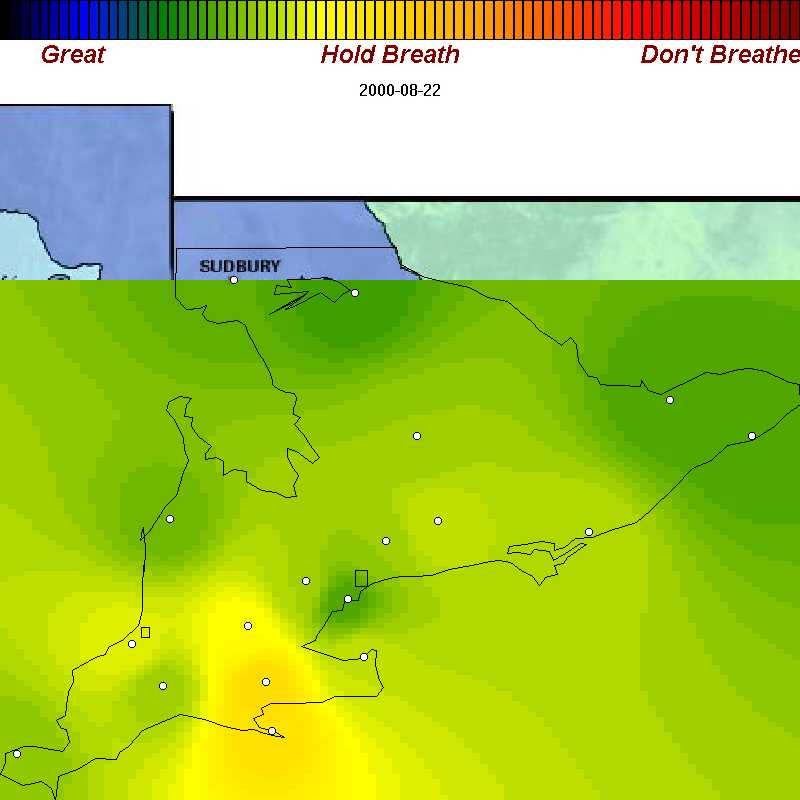
| August 22, 2000 | Poor air in Simcoe and Long Point - but farmers dont need to breath, do they? |
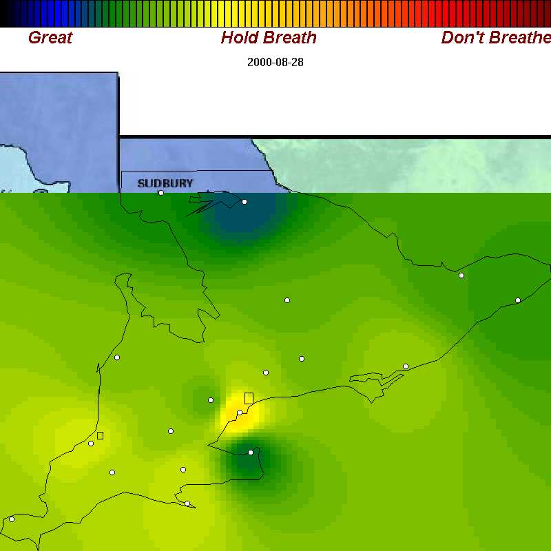
| August 28, 2000 | Rare air: poor air only in Greater Toronto area. |
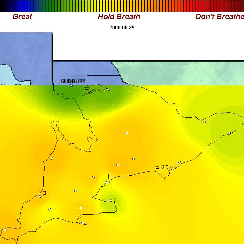
| August 29, 2000 | The next day: poor air everywhere except Toronto |
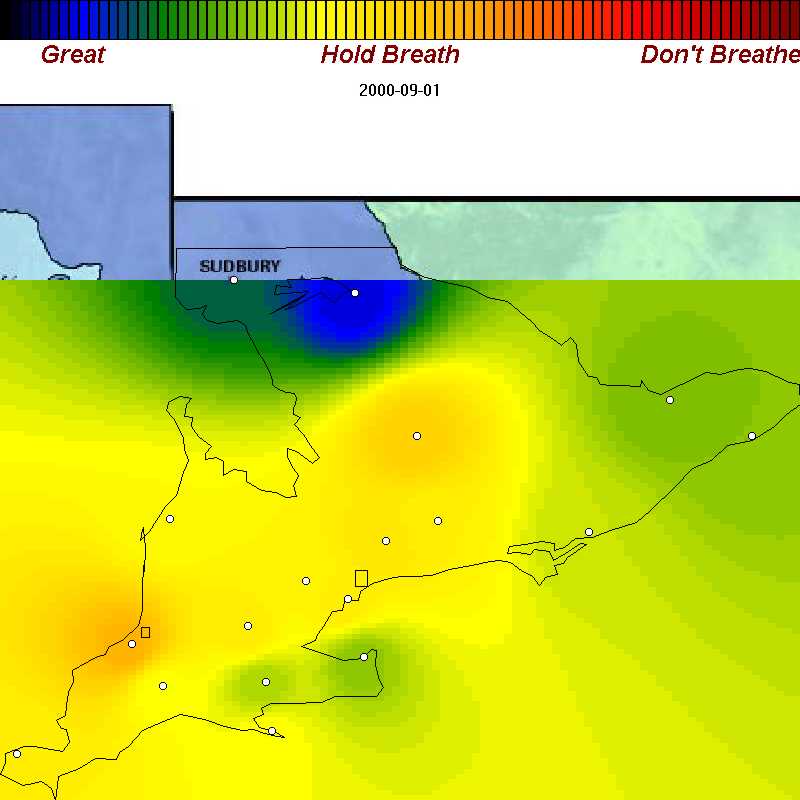
| Sept 1, 2000 | Fall begins with more poor air (except in North Bay - breath easy, Mike) |
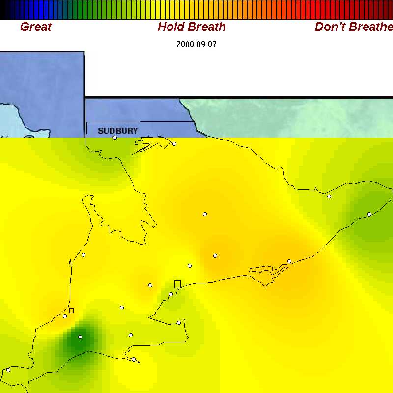
| Sept 7, 2000 | Labour day is past, but the pollution hangs on... |
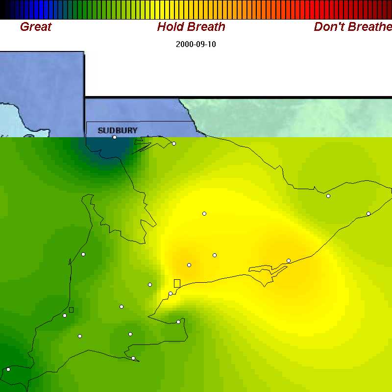
| Sept 10, 2000 | Poor air in Eastern Ontario |
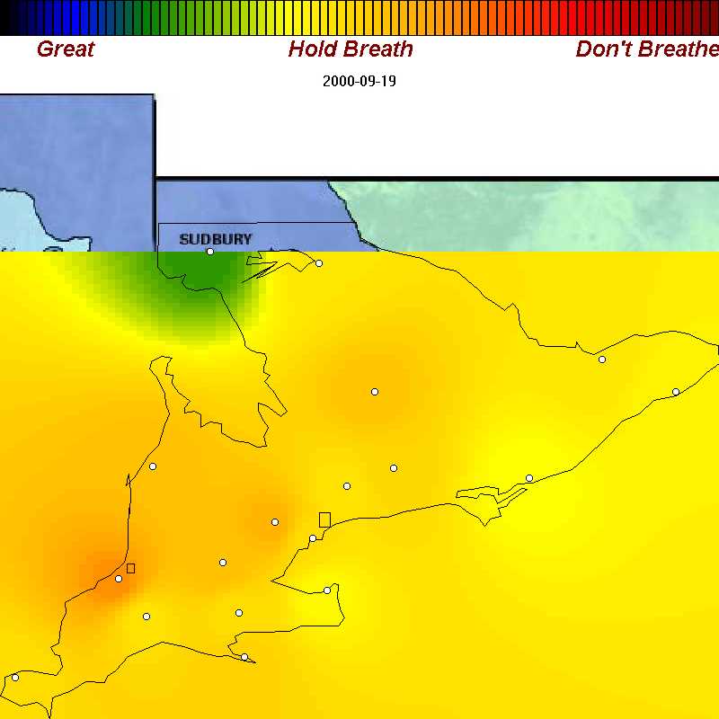
| Sept 19, 2000 | It's Tuesday, your kids are running in the schoolyard - in some of the worst air all year |
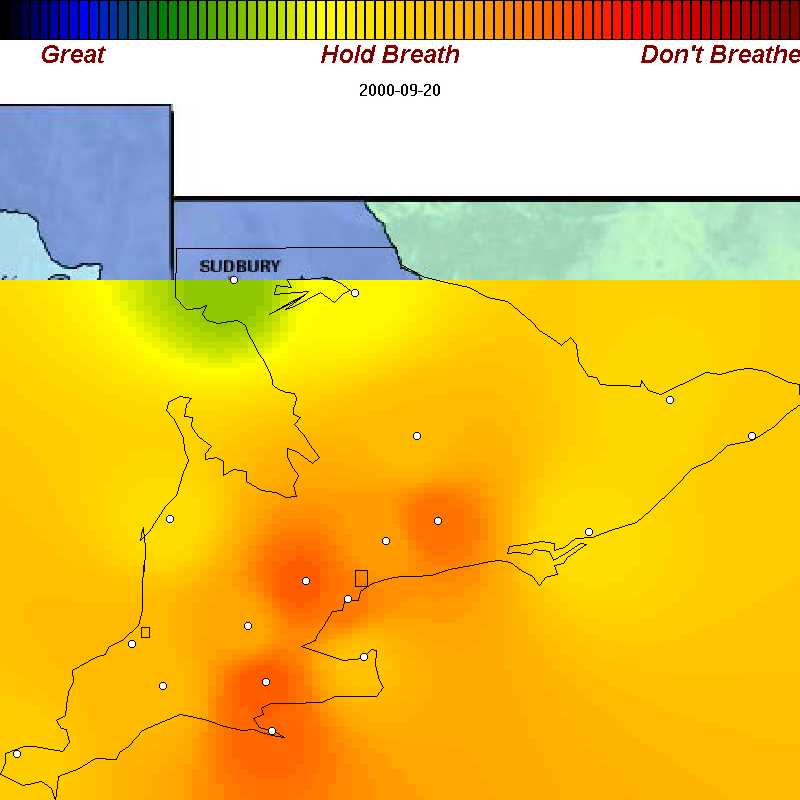
| Sept 20, 2000 | Summer ends with a bang - very poor air in Ontario's biggest cities |
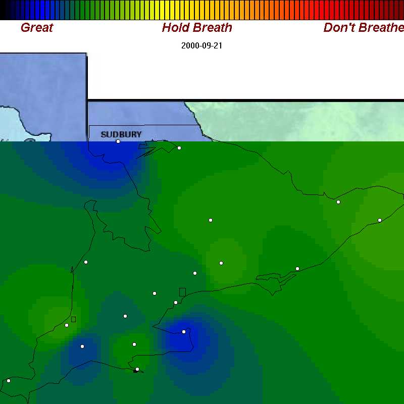
| Sept 21, 2000 | Good air becomes more frequent in fall. |
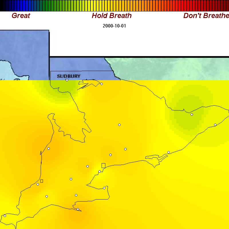
| Oct. 1, 2000 | Uniformly poor air to start October |
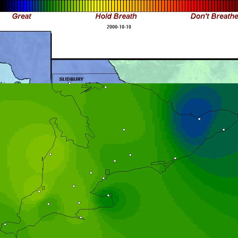
| Oct. 10, 2000 | A fine October day with the wind from the north - good air |
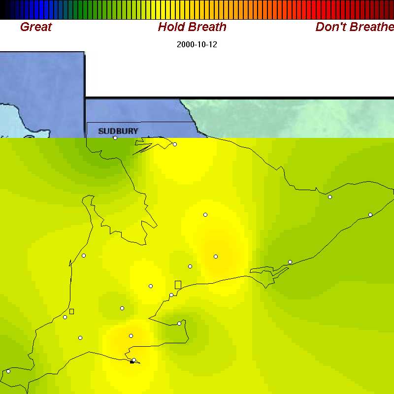
| Oct. 12, 2000 | Mild weather brings poor air from the U.S. |
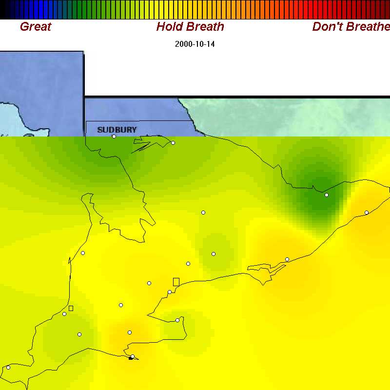
| Oct. 14, 2000 | Poor air for the whole Ontario shore - 4 million people plus |
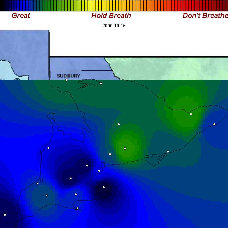
| Oct. 16, 2000 | A blast from the north brings really clean air |
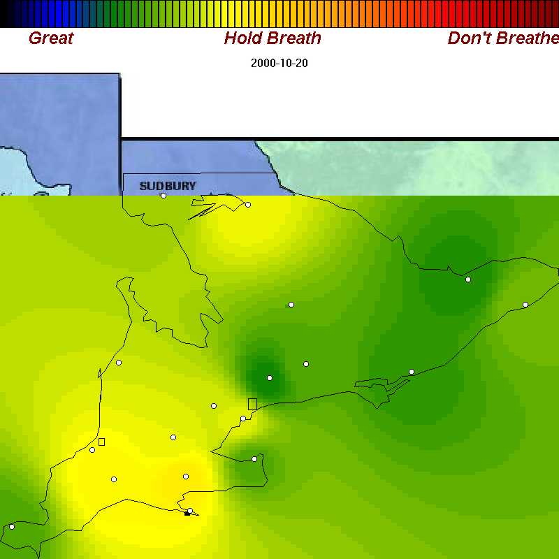
| Oct. 20, 2000 | A month into fall, poor air still hits SW Ont. from time to time. |
Why do cities such as Toronto, Windsor, and London often show "better" air than the rural areas around them? You can see this clearly in the map for August 14 .
This is a result of the atmospheric chemistry of smog production. Pollutants in cities, especially tailpipe emissions from dense traffic, actually temporarily reduce ozone concentrations in the immediate vicinity of large cities. Although ozone is less in the cities, the air is often actually more polluted by other pollutants such as small particles and volatile compunds.